Ranking the 37 Pac-12 Basketball Uniforms: Part II

Posted by Connor Pelton (@ConnorPelton28) on December 25th, 2013

After a month and a half of basketball, the Pac-12 teams have debuted 37 different uniforms. Here we rank them in a three-part series, starting from the bottom and working our way up. Today, #24 to #13. To view part one, click here

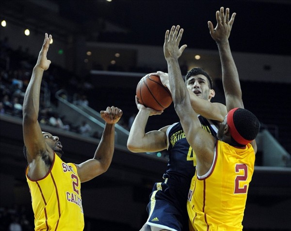
24. USC’s Golds

Roschon Prince  usc

Roschon Prince and USC’s Gold Uniforms

I like gold. Lots of people like gold. It is shiny and it looks good underneath the cardinal lettering. Like I have mentioned before with the Trojans, the curved team name is appealing too.

23. Utah’s BlacksThe black and red combination here is quite solid, and the block letters spelling out “UTAH” look great. This would have been rated higher, but the number is a bit too large and distracting.

22. Colorado’s WhitesIf you read the first installment of this series, you know that I don’t have a great affinity to white uniforms. But something about the black lettering, numbers, and font on this one just makes it work.

Read the rest of this entry »

Share this story

Ranking the 37 Pac-12 Basketball Uniforms: Part I

Posted by Connor Pelton (@ConnorPelton28) on December 23rd, 2013

After a month and a half of basketball, the Pac-12 teams have debuted 37 different uniforms. Here we rank them in a three-part series, starting from the bottom and working our way up. Today, #37 to #25. 

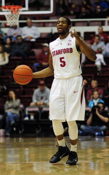
37. Stanford’s Whites

Junior Guard Chasson Randle Modeling The Worst Pac-12 Uniform This Season (credit: Uniform Critics)

Junior Guard Chasson Randle Modeling The Worst Pac-12 Uniform This Season (credit: Uniform Critics)

Look, there’s nothing awful about these unis, but they are just so simple. Nothing jumps out about it, and if I had only one word to describe it, it would be boring.

36. Washington State’s Whites: The “Cougars” font is impressive, but otherwise, it’s the same story. Plain and boring.

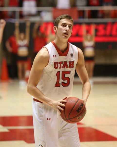
35. Utah’s Whites

Junior Guard Austin Eastman At The Free Throw Line (credit: Utah Athletics)

Junior Guard Austin Eastman At The Free Throw Line (credit: Utah Athletics)

This is an interesting uniform. It has potential, but is just a bit too busy. The number is too big and distracts from what could have been a nice design underneath the “Utah.” What the design is, we’ll never know, thanks to the huge numeral covering it up.

Read the rest of this entry »

Share this story

A Non-Sports Woman’s Guide to March Madness

Posted by rtmsf on March 18th, 2013

RTC_final4_atlanta

The RTC Babe is back this year to give her unique take on what we call March Madness.

March Madness is like the guy version of the Oscars. We spend weeks analyzing and guessing who will get a bid and then, once teams are selected, we spend another several days predicting the outcome. I like to think of right now — the days leading up to the Big Dance — as the red carpet. Sadly though there is lot less fashion to critique unless you want to include Digger’s daily tie selections or the occasional coach sporting a bold look (i.e., Pitino’s KFC getup.)

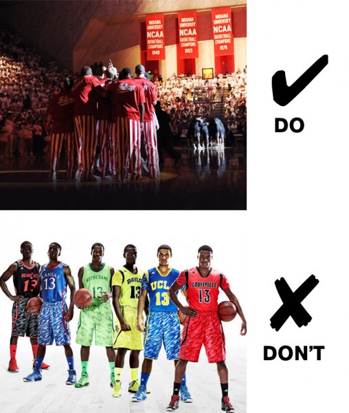
I have noticed a few trends this season, though. Expect to see a fair amount of neon colors on the floor. Especially bright greens and orange hues. But just like last year’s grey fad, this trend will be relatively short-lived in the Tournament. I’d recommend not picking teams with too much brightness in their outfits.

No. Just no.

No. Just no.

Something else I’ve seen a lot of this season is bold patterns. It’s risky, but when worn correctly, can look amazing.

Some Things Just Aren't Good Ideas

Some Things Are Better Ideas Than Others

As far as accessories go, watch for bold statement pieces, specifically those that are giant and head-shaped. They’re a personal favorite of mine. The more crazy heads I see in the crowd, the better I like that team.

Read the rest of this entry »

Share this story

College Basketball By The Tweets: Will Privette, Dunk(s) of the Year, and Those Baylor Unis

Posted by Nick Fasulo on January 16th, 2013

bythetweets

Nick Fasulo is an RTC correspondent who writes the column College Basketball By the Tweets, a look at the world of college hoops through the prism of everyone’s favorite social media platform. You can find him on Twitter @nickfasuloSBN.

What were arguably the two most memorable incidents to go down in college basketball the last seven days? On the court, it was certainly the game’s final four undefeated teams falling one by one over a 96-hour span. Off the court, err, on the sidelines, it was Robert Montgomery Knight revealing his age and inability to make out the difference between the shot clock and game clock during the final moments of Kentucky vs. Vanderbilt. The most underappreciated handle on all of Twitter encapsulated it beautifully.

C.J. Leslie and his friend Will Privette

To call it heartwarming would be an understatement, but whatever it is, C.J. Leslie’s Saturday afternoon was one he will never forget. First he dropped a game high 25 points as the Wolfpack upset then top-ranked Duke, which led to this photo that should be sold as a 24″ x 48″ poster at the school’s bookstore.

But even after the final horn sounded, Leslie was still being attentive on the court, ushering a senior student in a wheelchair to safety amongst the sea of red that was stomping all over the PNC Arena court.

Yes, naturally, Will Privette’s act has gone viral. The kid is one of the most sought after interviews in sports media right now, and it’s doing wonders to his social media clout.

Brandon Paul, Anthony Bennett, Jamaal Franklin. Who ya got?

Read the rest of this entry »

Share this story

Morning Five: 01.26.12 Edition

Posted by rtmsf on January 26th, 2012

  1. Gray is the way, so says the shoe company behemoth Nike, which on Wednesday unveiled nine new “platinum” uniform designs that will be worn by hand-selected schools that have won national championships as members of the Beaverton, Oregon, product line. Seven men’s schools — Arizona, Connecticut, Duke, Florida, Kentucky, North Carolina, and Syracuse — along with two women’s schools — Baylor and Connecticut — will sport the post-modern uniforms for one game later this season. These uniforms are certain to be a marketing hit in much the same way that some of their alt-football jerseys have been, most notably at Oregon. The template for each uniform is basically the same — a silver base with one primary accent color as trim — and you can see a few of the examples here: Kentucky, North Carolina, Syracuse. One interesting note is that each school has an aerographic star on the back of the jersey for each national title it has won. Kentucky’s, for example, has seven stars on its back. North Carolina has five, while Duke has four, and so on. Somebody needs to get Phil Knight on the phone immediately to explain to him the necessity of claiming Helms titles as national championships too. Right?
  2. Michael McKnight of SI.com checks in with an in-depth look at the point-shaving scandalthat enveloped the San Diego basketball program last year, and concludes that the evidence that the federal government thinks it has against former Torero star player Brandon Johnson and the other defendants might not be all that it’s cracked up to be. For one, the primary informant that the government relied upon for its information is not only marginally credible, but there may be major problems rendering his testimony admissible in a court of law anyway. Further, a review of the possible game that Johnson was most likely to have shaved points from — February 18, 2010 vs. St. Mary’s — shows that the evidence to support such a claim is less than persuasive. It’s an interesting read about a situation that made a very mild wave last year before everyone moved on to conference realignment, but one that SI has clearly done its work on in the interim.
  3. Seth Davis has been busy this week as we slip and slide into the final six weeks of the regular season. His always-fun mailbag column has made a re-appearance, and this time the topics ranged from the legitimacy of Missouri (written before the Tigers were RTC’d last night at Oklahoma State), the highest NCAA seed that Murray State can expect in March (we’d generally agree), the passion of Iowa’s Fran McCaffery (don’t you hate Iowa?), doubting San Diego State (and San Diego State?), and a few others (and everyone else?).
  4. Star treatment — it’s a fact of life in basketball at almost every level of the sport. From grade school to the highest of the professional leagues, defensive schemes are typically designed around stopping the other team’s best player. Mike DeCourcy takes a look at how such treatment has impacted an RTC favorite, Creighton’s Doug McDermott this season as game plans have adjusted to compensate for his ridiculous numbers (24/9 on 62%/50%/83% shooting). It’s true that his numbers have dropped a bit in conference play as the double-teams have come at him in earnest, but great players get their numbers regardless, and we have no doubt that McDermott will learn to adjust on the fly as he’s been so capable at doing throughout his short collegiate career.
  5. We mentioned this in yesterday’s M5, but the public unveiling of Gary Williams Court at Maryland occurred prior to last night’s game versus Duke at the Comcast Center. Even though the game ended up as yet another loss to the hated Blue Devils (1-10 in the last five seasons), the moments prior to the game were touching as Maryland fans received a final chance to cheer for and say goodbye to the coach that led the Terps to their greatest heights as a basketball program. Remember that Williams decided to retire after his star player last season, Jordan Williams, left school in early May to enter the NBA Draft. His many supporters and fans at the school had not had a chance until last night to give him a proper sendoff.

Share this story

The Fabric of their Lives: Part Two

Posted by cwilliams on October 13th, 2011

As we continue to Part Two of the Big 12 uniform rankings, I want to discuss a different role college uniforms play. The role of a fashion statement. For reasons unknown to me, jerseys, especially basketball jerseys, have become a fashion trend. Whether in a music video, a movie, or Joe Blow walking down the street, college basketball uniforms are seen on individuals who have never made a jump shot. I’ll admit it, I have a Missouri and a TCU basketball jersey that I occasionally wear, despite my short-and-skinny frame. It’s a questionable trend, but it’s one that, despite my criticism, I take part in.

Anyway, let’s continue with the uniform rankings. To track back, I ranked Iowa State as 10th, Oklahoma State as 9th, and Baylor as 8th.

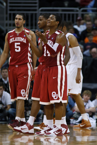
# 7.  Oklahoma

Meh.

History: 5. The Sooners have been consistent with their designs. Unfortunately, their designs have never been extraordinary.

Color Scheme: 3. Way too much white. Two stripes of white on top, one on bottom, and two on the sides. It’s called a secondary color, Oklahoma.

Script: 6. The script is slightly above mediocre. I like the way it curves, but it doesn’t exactly stand out.

Final Score: 14

#6. Texas

Read the rest of this entry »

Share this story

The Fabric of Their Lives: Part One

Posted by cwilliams on October 12th, 2011

If you look at uniforms objectively, they are literally nothing more than clothing. Technically, Duke’s uniforms are just as much an item of clothing as the 6th grade basketball team’s uniform at the local middle school. Sure, the quality of the material is better, but when it boils down, you’re left with a pair of shorts and a sleeveless jersey.  What makes uniforms special is not the actual uniforms, but the image they represent. When we see the argyle on the side of North Carolina’s jerseys, we are reminded of the prestige of its program, the rich history of winning the Tar Heels have earned throughout history.  However, uniforms do more than just remind us of past glory. A new uniform can represent a change in a program, especially if the past has been comparatively muddy. Recall when the Denver Nuggets drafted Carmelo Anthony and the Cavs drafted LeBron James — both teams got new uniforms to represent the ushering of their organizations into a new era.

Here, I’ll rank the uniforms of the Big 12 from worst to first. Today, we will knock out the worst three, and in coming days, I will complete the list.  There are three categories to rank the team’s aesthetics — its history, color scheme, and jersey script.

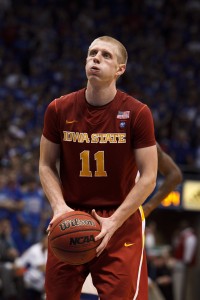
#10. Iowa State 

Condiments!

History: 2. These jerseys are relatively new. I don’t see them becoming relatively old.

Color Scheme: 1. Ketchup and Mustard. If Ronald McDonald was an AD, these uniforms would be his preferred threads.

Script: 3. Points for the bold font attempt. Unfortunately, the font is difficult to read, due to the yellow-white-ketchup combination.

Final Score: 6.

Read the rest of this entry »

Share this story

Yes, You Too Can Create an NC State Jersey…

Posted by rtmsf on September 10th, 2009

Update: the N&O took the link down.  Not sure what that’s all about.  Maybe they got another jorts ensemble submission?

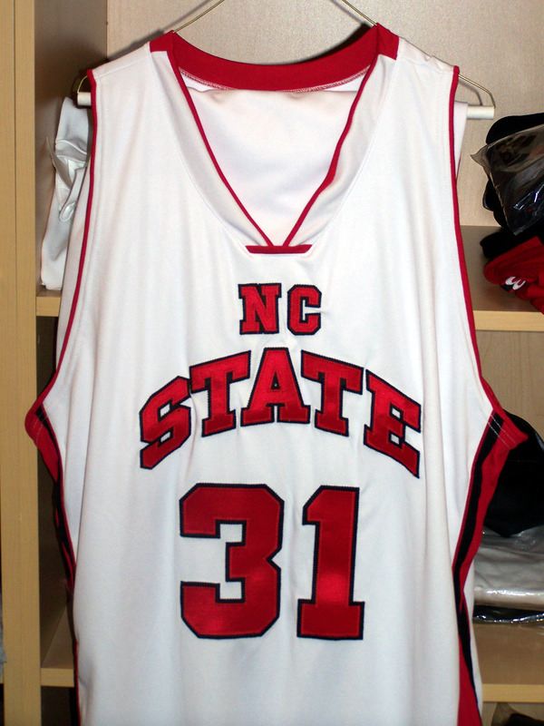
A number of years ago, NBA superstar Charles Barkley responded to a question as to how well he liked the Philadelphia 76ers new uniforms with the barb: “They look like my daughter got ahold of some crayons and designed them.”  We were reminded of that story when two weeks ago the NC State brass unveiled their new basketball uniforms amid much fanfare on a Twitter update from PackMensBBall (since deleted).  The twitterati were all over the new design (see what I did there?), which appears to have been a product of some NCSU marketing guru moron self-consciously coming to the realization that ‘nobody will know who we are if it just says State on it!’  Nevermind that the 1974 and 1983 NC State teams were plenty recognizable with just the “State” moniker attached.  Sooo…  the very next day after the online jersey rioting subsided, NC State scrapped the jersey and AD Lee Fowler said that their plan is to use a similar jersey to the ones the school wore last year.

nc state jersey 09 rejected

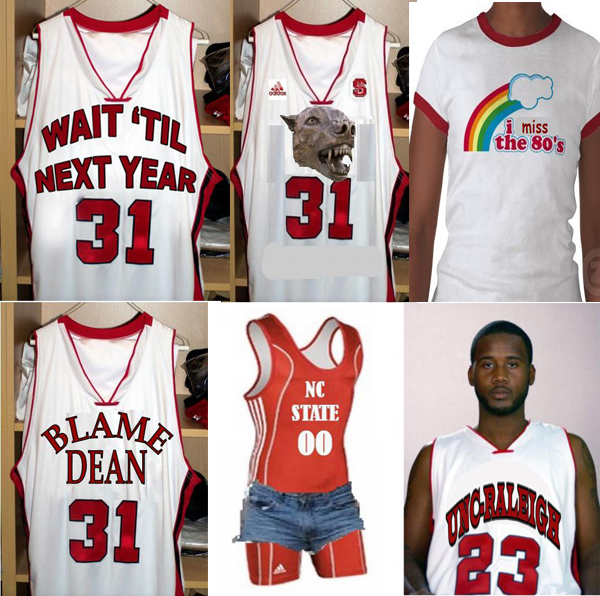
But it wouldn’t be the modern media to leave well enough alone.  So in today’s Raleigh News & Observer, the local rag is offering a contest for fans to upload their own homemade designs of what the new NC State jerseys should look like.  Given the hoops-centric focus of Tobacco Road (yeah, NC State is still a member), this could get pretty good.  There are currently two pages of uploaded designs, and here are a few of our current favorites.

ncsu jerseys

Oh yes.  The spandex/jorts ensemble.  Sidney Lowe should really look into this.

Share this story