


The Fabric of Their Lives: Part One
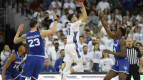
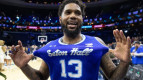
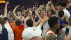
Posted by cwilliams on October 12th, 2011If you look at uniforms objectively, they are literally nothing more than clothing. Technically, Duke’s uniforms are just as much an item of clothing as the 6th grade basketball team’s uniform at the local middle school. Sure, the quality of the material is better, but when it boils down, you’re left with a pair of shorts and a sleeveless jersey. What makes uniforms special is not the actual uniforms, but the image they represent. When we see the argyle on the side of North Carolina’s jerseys, we are reminded of the prestige of its program, the rich history of winning the Tar Heels have earned throughout history. However, uniforms do more than just remind us of past glory. A new uniform can represent a change in a program, especially if the past has been comparatively muddy. Recall when the Denver Nuggets drafted Carmelo Anthony and the Cavs drafted LeBron James — both teams got new uniforms to represent the ushering of their organizations into a new era.
Here, I’ll rank the uniforms of the Big 12 from worst to first. Today, we will knock out the worst three, and in coming days, I will complete the list. There are three categories to rank the team’s aesthetics — its history, color scheme, and jersey script.
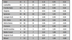
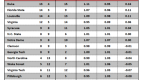
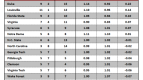
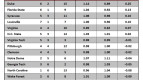
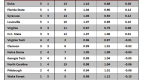
#10. Iowa State
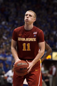
Condiments!
History: 2. These jerseys are relatively new. I don’t see them becoming relatively old.
Color Scheme: 1. Ketchup and Mustard. If Ronald McDonald was an AD, these uniforms would be his preferred threads.
Script: 3. Points for the bold font attempt. Unfortunately, the font is difficult to read, due to the yellow-white-ketchup combination.
Final Score: 6.
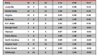
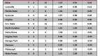
#9. Oklahoma State
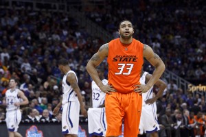
Jack-O-Lantern
History: 5. The italicized text has stuck around for a while, and has become somewhat recognizable.
Color Scheme: 2. Their home uniforms, white and orange, aren’t terrible. Their away uniforms are. They look like Halloween.
Script: 2. The italicized text is mediocre, but the mismatched sizes of the words “Oklahoma” and “State” does nothing for me.
Final Score: 9.
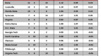
#8. Baylor
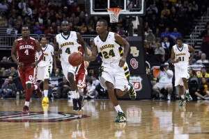
The Runnin' Comic Sans.
History: 3. They, uh, have been consistent with their colors?
Color Scheme : 5. It’s weird. Both colors are ugly, but together, they kind of match. Where’s the Baylor gold, though?
Script: 2. The jersey script looks like the favorite Microsoft Word font of a 12 year-old.
Final Score: 10
Tomorrow, we’ll rank #7, #6 and #5.