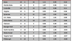
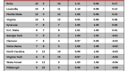


Ranking the 37 Pac-12 Basketball Uniforms: Part II
Posted by Connor Pelton (@ConnorPelton28) on December 25th, 2013After a month and a half of basketball, the Pac-12 teams have debuted 37 different uniforms. Here we rank them in a three-part series, starting from the bottom and working our way up. Today, #24 to #13. To view part one, click here.
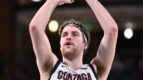
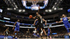
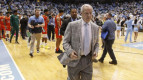
24. USC’s Golds

Roschon Prince and USC’s Gold Uniforms
I like gold. Lots of people like gold. It is shiny and it looks good underneath the cardinal lettering. Like I have mentioned before with the Trojans, the curved team name is appealing too.
23. Utah’s Blacks: The black and red combination here is quite solid, and the block letters spelling out “UTAH” look great. This would have been rated higher, but the number is a bit too large and distracting.
22. Colorado’s Whites: If you read the first installment of this series, you know that I don’t have a great affinity to white uniforms. But something about the black lettering, numbers, and font on this one just makes it work.
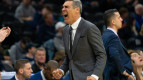
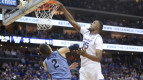
21. Colorado’s Blacks
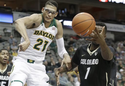
Freshman Forward Wesley Gordon Looking Good In His Crisp Away Uniform (AP)
The Buffs’ away uniforms are nice for three reasons. First, the white lettering of “Colorado” and the number style. Second, the gold angled collars up top look very good, and finally, the look of the numeral with its slanted nature is very appealing. All in all, a very good uniform for Colorado.
20. Washington’s Blacks: The combination of black, purple, and golden trim is perfect on these. The formation of the numbers is cool, but the best feature could be the shorts. I love the way the purple and gold complement the black.
19. California’s Golds: This is an underrated uniform. The Golden Bears have only worn them once this season, which was against Dayton in the Maui Invitational. The gold on gold looks great, and as I’ve mentioned before, the white and blue dots that stripe the sides are very original and new school.
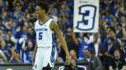
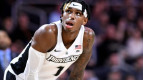
18. Arizona’s Whites
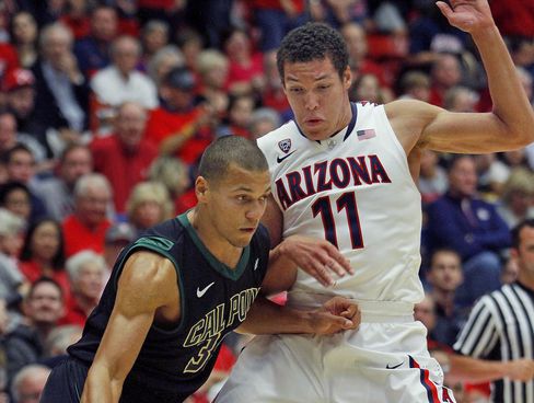
Freshman Aaron Gordon Modeling Arizona’s Home Uniforms (credit: John Miller)
I like the size and font of the “Arizona” and numbers, but the most impressive part of this jersey is on the back side. It features rays of sunshine at the top, a cactus in the middle, and a banner reading “Wildcats” across the bottom. Very creative by the guys at Nike.
17. Utah’s Reds: These are so bright, they are almost infra-red. And I love infra-red. They remind me of these Louisville threads from prior years, which were so red that they were almost orange. Anyway, back to the Utes. Besides the bright red features, the black lettering on top looks perfect. A very good production from Under Armour.
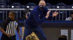
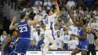
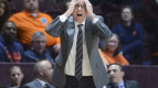
16. Colorado’s Grays
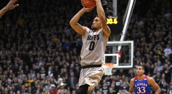
Junior Guard Askia Booker Shooting His Game-Winner To Upset Kansas In Boulder (credit: Pac-12)
Colorado broke these babies out for its upset of sixth-ranked Kansas, which makes them even better. The Buffaloes look good in gray, and the black lettering on top is superb. I also appreciate the “Buffs” on the front of the uniform. Creative and original.
15. Oregon State’s Blacks: The Beavers were re-branded by Nike last spring, and the first of the new threads they decided to debut were these. The black tops on black shorts is a nice clean look, and the small “Oregon State” lettering across the chest in orange looks nice. You have to go to the back of the jerseys, however, to view the most interesting part. If you look closely, there is a “ghost” Beaver logo at the bottom of a basketball net. Very swanky.
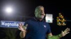
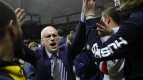
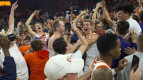
14. Arizona State’s Whites
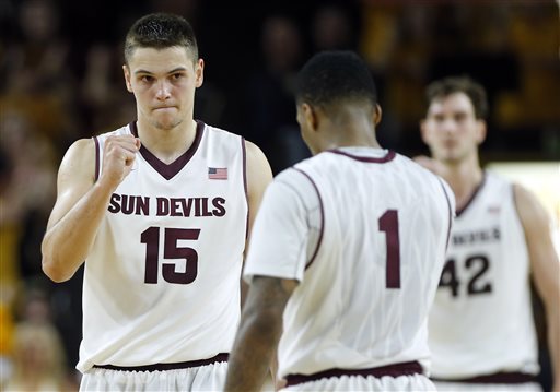
The Sun Devils Celebrate Their Win Over Marquette (credit: Matt York)
These may be slightly overrated at #14, but I like the font used for the “Sun Devils”, and the maroon looks great on top of the clean whites.
13. Arizona State’s Maroons: Back-to-back for ASU to close out the second part of this series, and boy do I love these. The maroon uniforms are spectacular, and the gold lettering and trim complement the threads nicely. Also, you’ve got to love the pitchfork/trident logo on the left side of the shorts. Very solid uniform.
Share your own thoughts in the comments, and check back for numbers #24-#13 later this week!
I'm from Portland. College basketball and football is life.