Introducing the Best Pac-12 Moments of YouTube Tournament

Posted by Connor Pelton (@ConnorPelton28) on November 12th, 2013

Next month, we here on the Pac-12 Microsite will start in with the first stages of a massive project; to find the best ever Pac-12 moment on YouTube.

p12 youtube banner

The braintrust here has selected three plays/sequences/moments from each team in the conference. We will put those up to a vote in separate posts over the next few weeks, and the top vote-getter from each school will advance to the bracket of champions.

“But wait, where do I come in?” Glad you asked. In addition to voting for each team’s representative, we ask that you put your own favorite moments from YouTube in the comments section or tweet them @rushthecourt, which we will add to the polls. Or, if you know of a video on some secret corner of the internet, put that in as well. The more the merrier.

So, get ready for diving-into-the-tunnel saves, NCAA Tournament buzzer beaters, and thread-the-needle passes. This is going to be fun.

Share this story

ESPNU Pac-12 Logo Tournament: Round 1

Posted by Connor Pelton on November 2nd, 2011

Beginning today and going thru Nov. 15, the RTC Pac-12 Microsite (that’s us!) will be holding a tournament to determine the best ESPNU Pac-12 logo. Beginning today you can vote for your favorite in a 12-team bracket style tournament. Drew and I have seeded them and placed them into the bracket. All you have to do is pick your favorite, or (here’s looking at you, Ute fans) vote for your favorite team regardless of how bad their logo is. Beginning tonight and going through Monday night, you can pick from the below matchups. Then come back on Wednesday to vote from a whole new set of matchups. Here we go!

#8 Oregon vs #9 Colorado

Connor’s thoughts: I flat-out just don’t like these logos. The Ducks’ only admirable quality is the green and yellow hat, and the only thing I like on the Colorado one is the steam coming out of its nose. I’m taking Oregon because the Buffalo has birds on top of it, and who even knows what’s up with that.

Drew’s thoughts: Tough first round matchup between logos that could cause the #1 overall seed trouble in the next round. I’ll take the Buffaloes here, but it’s a close call.


#5 Arizona State vs #12 Utah


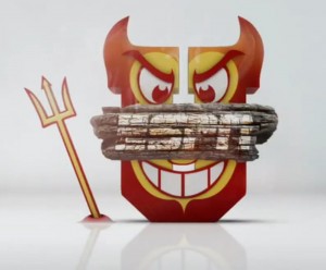
Connor’s thoughts: There’s no contest here. The Sun Devil is awesome, from the burnt piece of wood to the pitchfork. The Ute is just plain awful. If they put some effort into it and made the official Utah redhawk, maybe it would look better. Maybe.

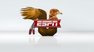
Drew’s Thoughts: The Utes have by far the worst logo. The only thing at all that indicates that it may belong to Utah are the feathers. One of the guys at BlockU came up with a better logo, and if that was the actual logo, Utah might have a chance. Or maybe not, because the ASU logo is pretty good.


Read the rest of this entry »

Share this story