Best Dressed: Marquette Warriors/Golden Eagles

Posted by rtmsf on June 20th, 2011

John Gorman is an RTC contributor. Every week throughout the long, hot summer, he will highlight one of the iconic uniforms from the great history of the game. We plan on rolling out 24 of these babies, so tweet your favorites at us @rushthecourt or email us directly at rushthecourt@yahoo.com. This week, we go modern with a superb uniform that is as interesting as any you’ll find throughout the annals. To see the entire list to date, click here.

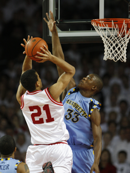
Milwaukee might seem at first to be an odd city to be lumped in with London, Paris and New York City as a fashion mecca, but for the past half-century, it’s been just that. Marquette is the fifth avenue of college basketball, a place where color and design mingle with the backdoor cut and alley-oop.  I delved into the Golden Eagles’ uniform history enthralled, as many are, by their present-day powder blue alternate jerseys, a dynamic marriage of soft color and psychedelic accent. Anyone who watches college basketball can’t help but marvel at the joyous cocktail party of navy, gold and white flourishing at the fringe of the powder blue canvas. But to assume Marquette’s foray into uniform utopia is a recent development is to ignore the school’s trend-setting tradition.

Marquette Has Long Been a Uniform Trendsetter

Starting with the arrival of Al McGuire, a colorful coach with an eye for detail and an independent spirit, the basketball team continued to find new and inventive ways to separate itself from other hoops havens by virtue of their visual appeal. Twice in their history, Marquette’s jerseys were too bold for the NCAA, leading to bans on their outrageous fashion sense.

The bumble-bee jerseys of the early 70s, which disoriented opposing players to the point of delirium, and the un-tucked jerseys (designed by starting guard Bo Ellis) that bore an uncomfortable resemblance to baby bibs, were both outlawed in a span of less than a decade. McGuire’s fashion sense sought a competitive advantage on the court, both in recruiting and at the merchandise counter. The Golden Eagles were the hottest act in college basketball, a must-see TV spectacle due as much in part to their colorful uniforms as much as their multi-hued (and successful) brand of basketball.

Read the rest of this entry »

Share this story

Best Dressed: Hoya Paranoia

Posted by rtmsf on June 14th, 2011

John Gorman is an RTC contributor. Every week throughout the long, hot summer, he will highlight one of the iconic uniforms from the great history of the game. We plan on rolling out 24 of these babies, so tweet your favorites at us @rushthecourt or email us directly at rushthecourt@yahoo.com. This week, we travel back to an era of powerful and fearsome basketball emanating from our nation’s capital. To see the entire list to date, click here.

You’ve probably asked yourself. “What’s a Hoya?” You wouldn’t be alone. Many think a Hoya is the breed of, or name of, a dog that appears as the logo of the Washington, D.C.-based basketball kennel. They are wrong. It isn’t anything. Not an animal. Not a plant. Not a person. Not a war formation. Not an endemic entity to the Beltway, political reference, or inside joke. It is a Latin Greek [ed. note: corrected] word, which literally translates to the declarative “what.”

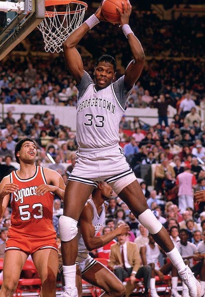
These Uniforms Represented Fear in the Mid-80s (SI/M. Millan)

Now, you’re probably asking yourself, “How do you visually represent a ‘what’?” Georgetown University traditionally used a slew of canines to represent the school at home games, but when the varsity football program went under in 1951, the institution was left without an official mascot. Thirteen years later, the students bought an English bulldog named “Yellow Jacket,” whom they wanted to rename “Hoya,” but would only respond to “Jack.” He’s the dog you see on the Hoya unis.

The blue and the grey Georgetown features are the exact shades of both the Union and Confederate civil war armies. This is no accident. Georgetown’s various teams have long since worn the colors to show the unity between the northern and the southern students at our nation’s capital, just south of the old Mason-Dixon line.

Read the rest of this entry »

Share this story

Best Dressed: Indiana Hoosiers

Posted by rtmsf on June 6th, 2011

John Gorman is an RTC contributor.  Every week throughout the long, hot summer, he will highlight one of the iconic uniforms from the great history of the game.  We plan on rolling out 24 of these babies, so tweet your favorites at us @rushthecourt or email us directly at rushthecourt@yahoo.com. This week, we honor the timeless classics of our friends from Bloomington, Indiana.  To see the entire list to date, click here.

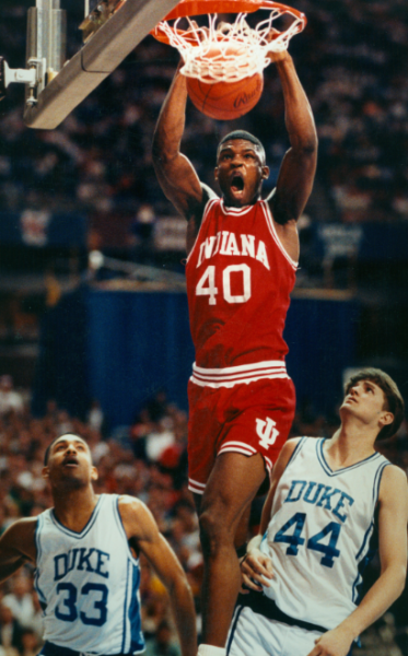
We wanted to profile the Indiana Hoosiers uniforms for duochromatic simplicity, but we couldn’t pick out specific years to highlight because Indiana’s threads never change. Indiana basketball exists in an alternate realm adrift from time and space. They are college basketball’s iconic lone wolf.

Existing in a powerhouse football conference known as the Big Ten, Indiana is the only card-carrying member that can be safely categorized as a “basketball school.” In fact, Indiana University is so basketball-centric that the entire state seems to have followed suit. The Pacers, Purdue, Larry Bird, “Hoosiers,” and Butler – none of these would be possible without the popularity, success and tradition of IU hoops. The orange orb is as much a part of the state’s lore as the maize and wheat-soaked fields. You envision rogue, undiscovered kids playing one-on-one on farm parcels, like young little basketball Roy Hobbses, with John Cougar Mellencamp’s heartland anthems blaring from a boombox in the background.

They Don't Change Much, And Why Would They? (IU Media Relations)

Indiana’s uniforms rock crimson and cream, a design uncluttered by the mess of third-jerseys, Nike redesigns, logo changes or additional colors rolled in to make a quick buck at the merch counter. When you buy an Indiana jersey, you’re either from Indiana, or you’re buying into the aesthetic of classic, old-time fundamentalism — a puritan work ethic mixed with corn-fed talent, unfiltered and unrefined.

Read the rest of this entry »

Share this story

Best Dressed: 1995-2004 Maryland Terrapins

Posted by rtmsf on May 31st, 2011

John Gorman is an RTC contributor.  Every week throughout the long, hot summer, he will highlight one of the iconic uniforms from the great history of the game.  We plan on rolling out 24 of these babies, so tweet your favorites at us @rushthecourt or email us directly at rushthecourt@yahoo.com. This week, we recall the great Maryland uniforms from the mid-90s through the early 2000s.  To see the entire list to date, click here.

Fear the turtle. A phrase that elicits smiles from same mouth which speaks its words, but before 1932, would have never seen the light of day without the help of an inquisitive school paper and a Maryland man named “Curley.”  The campus daily, The Diamondback, called out for a school nickname to replace the “Old-Liners,” a reference to the state nickname. Harry Clifton Byrd, the school football coach affectionately known as “Curley”, answered the call. Curley proposed “Terrapins,” a nod to the Diamondback Terrapin turtle endemic to his Chesapeake Bay hometown of Crisfield. As Byrd moved up to the ranks from football coach to athletic director to university president, the Terrapin was minted, popularized and given an identity.

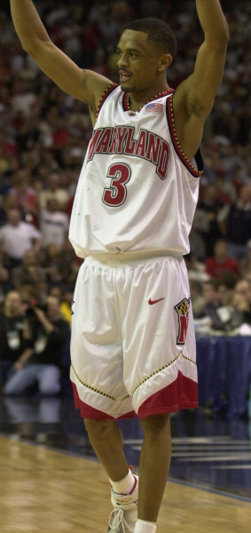
Maryland Was At Its Hoops Peak in These Uniforms (UM Athletics)

The Diamondback Terrapin is green, gray and white, but the school’s red, white, black and gold model is colored after the alternating Calvert and Crossland emblems that appear on the Maryland state flag. You’ll note if you look closely, this same pattern also provides the inspiration for the mid-field Baltimore Ravens’ crest (which doubles as the team’s secondary logo).  The logo and mascot which appears on the threads, “Testudo,” draws its moniker from an old Roman warfare formation where soldiers would pack together closely, and flank all sides with shields, to protect the formation from incoming arrow attacks. Testudo, fittingly, is Latin for “Tortoise.”

Always an aesthetic pleaser and a huge draw at the box office (former Terps coach Lefty Driesell is commonly credited for starting Midnight Madness), the school’s profile rose considerably in the 1990s, as coach Gary Williams built a consistently competitive program. It was at this time Nike stepped in and did what Nike does: Doctored up the athletic wear to entice the locals to buy.  Nike gave the home whites some pop: A big, bold MARYLAND on the front with even bigger, bolder red numbers, and – the perfect touch – black and gold diamondback trim along the edges, crafting that quintessential snapping-turtle look. Never before has something so slow looked so fast streaking up and down the hardwood.

Read the rest of this entry »

Share this story

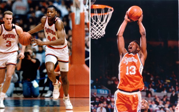
Best Dressed: 1980s Syracuse Orangemen

Posted by rtmsf on May 23rd, 2011

John Gorman is an RTC contributor.  Every week throughout the long, hot summer, he will highlight one of the iconic uniforms from the great history of the game.  We plan on rolling out 24 of these babies, so tweet your favorites at us @rushthecourt or email us directly at rushthecourt@yahoo.com. This week, we tip things off with the Syracuse threads from the 1980s.  For the complete list to date, click here.

You young whipper-snappers may not remember, but there was a time long before the “men” and “women” were unceremoniously axed from the school nickname in a move to eliminate perceived gender and religious biases, when the Orange men really were Orangemen.  In fact, until 2004, the school was never really named after the color; but rather derived its moniker from the Irish and Scottish protestant fraternal organization. That orange you see on the Irish flag? That’s Syracuse Orange.  And flags aside, the colorful cast that rocked those threads could make citrus jealous.

Orange Meant Something Special in the 1980s (SU Athletic Communications)

The bold Valencia hue made the players instantly visible to each other, to opponents and to fans. Amazingly, it hasn’t always been the school color. Prior to 1890, the school swatch, despite being the “Orangemen,” was rose pink and pea green. But, the switch was made and by the time the newly-formed Big East Conference took shape in the 1980s, the Syracuse duds were among the most widely marketed and broadcasted in the USA.

Aided by a heaping helping of media members pimping their school whenever possible (many prominent broadcasters, journalists and media execs graduated from their prestigious S.I. Newhouse School of Public Communications), you had to really strain to avoid the Orange crush. The cursive Syracuse draped over luminaries like Derrick Coleman, Dwayne “Pearl” Washington, Sherman Douglas, Lawrence Moten, John Wallace, Billy Owens, Danny Schayes and Rony Seikaly.  Steeped in basketball tradition, and set inside an iconic, imposing Carrier Dome, Syracuse basketball was equal parts hip and classicist, loud yet refined, and the threads did justice.

The Orange and Blue stood out then much like a patented plaid Boeheim blazer, and the color scheme was the perfect competitive differentiator throughout the golden age of Standard Definition TVs, during which the Big East lorded atop college basketball, built a mountain of endless grays, blues and reds.  Stylish. Loud. Unique. Syracuse was (and still is) Orange, and still the college basketball standard by which other teams who dare to wear orange are measured. Like it or not, if you ever say, “I’m for the Orange”, nobody anywhere will ever think you mean Clemson.

Share this story