


Get Used To Souped-Up Court Designs
Posted by Chris Johnson on May 31st, 2013College sports programs like to distinguish themselves in readily identifiable and often objectively hideous ways. Wacky uniforms are a micro-mechanism for audacious school-specific branding, and if we’re going to talk crazy uniforms….naturally, we’re going to talk Oregon, whose revolving door of Nike-conceived threads are as much a part of Ducks’ sports culture as athletic competition itself. OU expanded its reach into the aesthetic wilderness with its foliage-themed “Tall Firs” basketball court, which was unleashed to mixed (but mostly negative) appraisals from non-Oregon partisans nationwide. Innovative Nike architect Tinker Hatfield’s plan was ambitious, to apply the most minimal interpretation, and the real thing was gorgeous and repulsive and historic (the trees are meant to pay homage to Oregon’s 1939 national championship team, nicknamed “The Tall Firs”) and brand-inspired, all at the same time. It wasn’t the first time Oregon had jumped headlong into the avante-garde realm of program-patented design eccentricity, and it probably won’t be the last. I can’t wait to see what Phil Knight and his Nike braintrust henchmen dream up next. A duck-shaped Autzen stadium? Optionally-rotational field turf to match each game’s uniform alteration? Something insane. Something mind-blowing. Something Allianz Arena can’t touch in its most visually-arresting elegance.
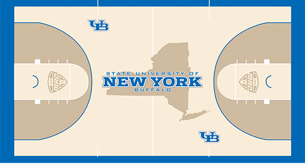
Another new court design proves schools are taking artistic court stylings more seriously (Buffalo Athletics).
Kind of like what Florida International and George Washington and, following Wednesday’s stunning reveal, the University of Buffalo, which plopped a New York State Silhouette around its trademark royal blue U of B-stamping text, implemented this offseason. The design itself is a conservative but fresh look for a program whose basketball program doesn’t typically make headlines for anything it accomplishes on the court, and you know what? Good for them. Attention grabbed. This floor plan caught my fleeting web-scanning attention span, even if I’m not particularly fond of the subtle state-owning intimation/appeal to territorial ownership located smack dab at center court. If dreaming up fancy court designs is about making a splash and giving your university an unmistakably unique and school-centric vibe, this court does exactly the opposite. “State University of New York” is an official part of Buffalo’s whole name-recognized branding description; it’s the little description that appears in size eight italicized text next to (wait for it) “University of Buffalo” on every hoodie and coffee mug and every last folder and pencil available in the official university library campus store. But did anyone stop to consider the possibility that making the word Buffalo, the actual university, bigger than New York, the state that houses it, might be a smart way to send a visual message for BUFFALO itself, and not state silhouette-contrasted NEW YORK? The text size contrast, and text placement, obscure the entire purpose of sports court design eye candy. They don’t even highlight the University’s own name.