


The Fabric of Their Lives: Part Three
Posted by cwilliams on October 17th, 2011Today, we finish the uniform rankings of the Big 12, as we reveal #4, #3, #2, and #1. First, I want to touch on the most important feature of a college basketball uniform: uniqueness. The more unique the uniform is, the more it is that they will be talked about. However, introducing a unique uniform is high-risk and high-reward. UNC’s jersey is, in my mind, the best uniform in college basketball. It’s uniqueness with the argyle and phenomenal color scheme make it impossible to beat. On the contrary, teams like Oklahoma State or Marquette, whose attempts for uniqueness involve bright and obnoxious colors, are some of my least favorite jerseys. A strong uniform becomes an identity of your program, and a strong program should have a strong uniform. So here goes… the top four.
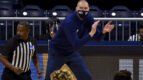
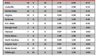
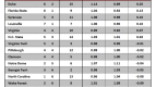
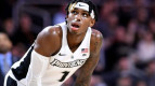
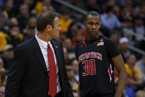
#4. Missouri
Needs More Jersey Patches, I'd Say.
History: 7. Mizzou got new threads last year, but they simply modernized their jersey. No change was substantial, and their jerseys have remained true to their school colors of black and gold for decades.
Color Scheme: 9. Missouri’s black and gold has become one of the most recognizable color scheme in the world of college sports, up there with Texas, Kansas, North Carolina, and Notre Dame.
Script:4. Unfortunately, the script is the downfall of Missouri’s aesthetics. The text looks like a font from Cartoon Network, and does not induce fear or intimidation upon its opponents.
Final Score. 20
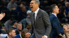
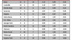
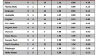
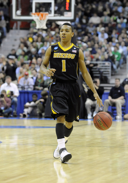
#3. Texas Tech
At Least Their Jersey's Are Talented.
History: 6. The Red Raiders lack a illustrious basketball history, but they have been consistent with their colors.
Color Scheme: 7. The Red Raider black and red is an intimidating combination, and looks great on all uniforms, not just basketball. The subtle addition of white is a great touch to complement the dark red and black.
Script: 8. Not too big, not to small, not too cartoon-ish. The red letters are bold and curved, and the white outline greatly boosts the scripts’ visibility.
Final Score: 21.
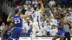
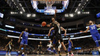
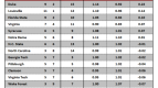
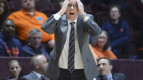
#2. Kansas
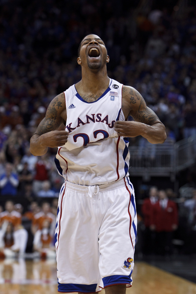
Marcus Morris Celebrates the Awesomeness of his Jersey.
History: 10. Kansas has one of the most prestigious programs in all of college basketball, and their uniforms honor that history. They stick with their Kansas blue and red, and attach a subtle Jayhawk logo to the shorts.
Color Scheme: 7. They utilize their red-and-blue splendidly. Unfortunately for them, I’m not a big fan of the red-and-blue combination on a uniform.
Script: 8. The curving Kansas with a unique text have been an aspect of Jayhawk uniforms since the birth of their team.
Final Score: 25
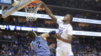
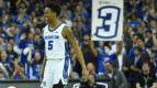
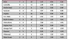
#1. Kansas State
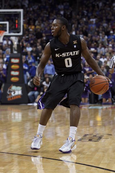
Your 2011-12 Uniform Champion.
History: 6. Kansas State actually has had some heinous jerseys in their history. Think about the mid-90s, and the Michael Beasley era. However, they get points for staying true to their colors, but making them exponentially better than their uniform forefathers.
Color Scheme: 10. The combination of purple and black is both intimidating and attractive. They focus on the black on their away threads, and their home jerseys are predominately white. However, the subtle secondary color and the addition of white and silver make the Kansas State color scheme phenomenal.
Script: 10. Short, bold, and unique. The text is italicized, wonderfully bold and outlined, and the fact that is reads “K-State” and not Kansas State creates a certain uniqueness I spoke about earlier. And as aforementioned, this uniqueness is what all athletic departments should strive for.
Final Score: 26.