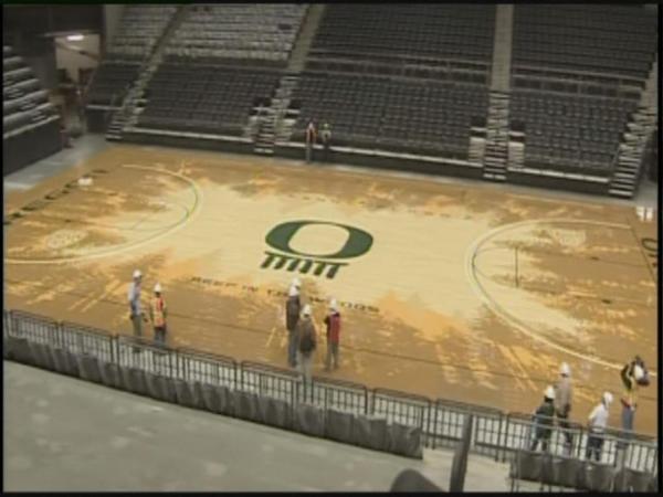
Oregon’s New Court: An Unvarnished Rorschach Test?
Posted by rtmsf on November 7th, 2010Phil Knight is known as many things, but being a bore isn’t one of them. The founder of Nike who has launched hundreds of campaigns of cool over the past three decades is a well-known University of Oregon supporter, and his creative stamp on Duck uniforms has given legions of commentators great discussion material over the years. As we all know, Oregon’s brand new hoops home, the Matthew Knight Arena, is scheduled to open for business in early 2011 and the Nike CEO may have outdone himself this time with its design. Or more specifically, the design of the centerpiece of the building — the Ducks’ basketball floor.
This isn’t the best photo, but the floor, designed by Nike’s VP for Design and Special Projects Tinker Hatfield, depicts the evergreen forests that the Pacific Northwest is known for with the motto “Deep in the Woods.” There’s also a secondary meaning behind the floor, as UO’s 1939 national title team (in the first NCAA Tournament) was nicknamed the “Tall Firs.” Hatfield, who may have staked his reputation and career on this design, had this to say: “We wanted to design the most iconic television presence possible for the University of Oregon by conjuring up a highly unique and visible basketball floor design. It’s inspired by our beautiful tree-covered region and the UO 1939 NCAA Championship basketball team nick-named the ‘Tall Firs.’”
Score one for unique and visible. But unless Hatfield was going for the always-hip unvarnished Rorschach Test look, we’re not sure what he was thinking. Looking at this thing makes us want to climb down there with a bucket of paint and a few brushes — well, after we’ve spent an hour wondering why the iconic Oregon “O” sits upon what appears to be a Stonehenge structure that spells out Tatt (ed. note: obviously, it is supposed to read “Matt”). Other than wondering where that damn sailboat is hidden, we see a few problems with this floor. First of all, the actual floor doesn’t have nearly the contrast of the artist’s rendition (see below), but we’re honestly not sure if that would make it better or worse. Next, other than the emerald in the lettering and playing lines, this floor doesn’t really appear to capture the school’s primary colors of green and yellow. It looks more like wood color, which would be fine on its own if they weren’t actually going for something else.
Color us skeptical, but maybe this floor will look a lot better in high-definition television with 12,000 green/yellow-clad screaming fans around it come January, but for now, we’re more aghast at this design than anything else. This floor in its current form is definitely a candidate for our Ugly Floors post from a couple of years back. We will say this about Oregon, though — more than any other school in America, they’re willing to try new and imaginative things, even if those attempts are incredibly ugly and easily mocked.


The entire arena, including the floor and the logo, has me ashamed to be a student at the University of Oregon. It’s a joke. There’s no (non-dollar-sign-related) reason for the school to leave Mac Court, which has more charm, soul and atmosphere than this new building will ever have. I plan on sitting down in the Pit Crew (which will lose the coolness of its name when the team leaves The Pit) for the first game with a sign that says “Free Mac Court.”
I couldn’t agree more. I sort of understand the need for keeping up with the Joneses in regards to facilities for the sake of recruiting, but kicking Mac Court to the curb is a sin… At the very least, I would hope that maybe the team would play one game per year over there, considering they ain’t going to be bold enough to tear that place down…
Shorter Oregon: HEY EVERYONE LOOK AT US
The only positive is that it doesn’t have a ridiculously oversized center floor logo. My personal theory: If a player shoots from anywhere on the center logo, one of two things should happen, a buzzer should sound before the shot comes down, or the player should be benched for a long time. Otherwise, the logo is too large. Although in this instance, a big logo might be better since it would force the trees to recede.
@MattB – hilarious. Can we get a few lumberjacks to put in some work in the MKA?
Hey Oregon someone dropped bleach at center court
Yes, there are a LOT of reasons to leave Mac Court.
Terrible sight lines
90 years old
Very few restrooms
Bad concessions
cramped corridors
As a non-Oregon person, I sort of like it. Better said, it doesn’t offend or seem offensive. It’s subtle enough, seemingly, not to distract from the action on the court, atleast that’s my impression from these photos. The bleach comment is funny though.
looks like a duck took aim to the floor and splattered his lunch at center court…
i honestly thought it looked pretty cool as an urban/graffiti/tagged/paint spill look.
now that i see it is supposed to be trees, it looks a little silly.
Have you seen what #Oregon has planned for its new basketball arena's court design? Yes, it's a bit different… http://bit.ly/aKyofE
I’m not sure that pictures does the court justice. The resolution doesn’t seem that high. With the shining likes and the high def TV cameras I’m sure it will look a lot more like artists rendering. I’m looking forward to seeing it on TV.
I think it looks cool…glad its not the same old boring crap you see EVERY GOSH DARNED DAY!
In regard to keeping an old court updated….I’m a Purdue student and they are currently adding a $90 million addition to Mackey Arena rather than building a new one. They will be renovating seats inside and have already renovated all of the concourses. They are creating great club level areas for those donating alumni and have created a premier practice facility and sports medicine area. It sounds like a renovation of these sorts would have better received. I must say watching games at UO’s old arena was always interesting. It was a great looking building from the inside.